Introduction
This resource aims to show you some of the more advanced features of Microsoft Excel Version 2006 for Microsoft 365. It is assumed you already know how to do the following:
- Enter numbers and text into cells
- Enter formula into cells for automatic calculation
- Change the format of cells to improve appearance, e.g. number of decimal places, centering, using scientific notation, etc.
- Change the page format to improve appearance, e.g. adding headers and footers, inserting images, using styles, changing colours, etc.
- Add and delete worksheets, rows and columns. Rename worksheets.
The really powerful features of Excel are its mathematical, data analysis, and graphing capabilities, so this resource will introduce you to some of these. On a personal note, I used Excel, way back in the 1990s, to produce a radar model for accurately predicting target signal size, so it is no exaggeration to say that it is a key software tool for any engineer's toolbox.
The Excel features we will look at are:
Relative and Absolute Cell References
Sorting, Filtering and Searching Data
Presenting and Analysing Data using
- Conditional Formatting
- Statistical Functions
- Graphical Charts
- Pivot Tables
We will examine these features using examples and we hope you find this a useful resource to help you analyse, evaluate and present data and calculations for your coursework and project reports.
Relative and Absolute References
You probably already know how to write formulae in Excel using the '=' sign, and how to copy and paste from one (or a group) of cells to another, but you might not know that the two types of cell references used, sometimes determine how data is copied.
A) The Excel default is relative referencing, with cells addressed by their column and row references, e.g. A4, C7, GK3056, etc. When you copy these cells, to use in formula (by left clicking or by typing the column/row reference), Excel will automatically change the 'addresses'. For example, if we have data in Figure 1:
| A | B | C | D | |
| 1 | 10 | 100 | = A1*B1 | |
| 2 | 11 | 200 | ||
| 3 | 12 | 300 | ||
| 4 | 13 | 400 |
Figure 1
The answer appearing in cell C1 will be 10 x 100 = 1000.
Then if we copy cell C1 to cell C4, the answer appearing in cell C4 will be 13 x 400 = 5200, because the relative cell references will change from A1 to A4 and from B1 to B4 (to match C4).
If we copy cell C1 to cell D1, the answer appearing in cell D1 will be 100 x 1000 = 100000, because the relative cell references will change from A1 to B1 and from B1 to C1 (to match cell D1).
What number will appear in cell C3, if we copy cell C1 to it? And then in cell D3?
C3 = A3*B3 = 12 x 300 = 3600. Then D3 = B3*C3 = 300 x 3600 = 1080000
This may seem quite annoying, but actually it is really useful if we have a list of variables that we want to do the same calculations on. For example, assume we want to find the instantaneous amplitude of a sine wave at various angles specified in degrees, and we also want to see the angles expressed in radians. We would just need to write the formula to change degrees to radians in one cell and the sine wave formula in another (see Figure 2), then we could select and drag the little box at the bottom right of the cell, to get all the answers in every other cell we want.
| A | B | C | |
| 1 |
Angle in degrees |
Angle in radians |
Sine Wave Amplitude |
| 2 | 0 | =RADIANS(A2) | =5*SIN(B2) |
| 3 | 10 | ||
| 4 | 20 | ||
| 5 | 30 |
Figure 2
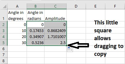
B) An absolute reference is defined by adding a $ sign to either the column reference, the row reference, or both, e.g. $A$5, $D7, F$23. The reference just after the dollar sign will not change when you copy the cell contents to another cell. This is quite useful if you want to define some constants. For example, in the sine wave example above, say we wanted to add a constant phase shift (0.236 radians) to every answer in column C. We could define this phase shift in another cell, say cell E1 (see Figure 3), and make this an absolute reference by either typing the dollar signs after we had copied the reference 'address', or by cycling through the F4 key to get $E$1.
| A | B | C | D | E | |
|
1 |
Angle in degrees |
Angle in radians |
Amplitude | 0.236 | |
| 2 | 10 | =RADIANS(A2) | =5*SIN(B2+$E$1) | ||
| 3 | 20 | ||||
| 4 | 30 | ||||
| 5 | 40 |
Figure 3
So then copying cell C2 to cell C4 will give = 5*SIN(B4+$E$1) (which will, of course, give an invalid result, if cell B4 hasn't been calculated).
What number will appear in cell C5 if we copy columns A, B and C by selecting and dragging, as before?
C5 = 5*SIN(B5+$E$1) = 5*sin(radians(40)+0.236) = 3.4331528
Improving Sheet Readability
You may have noticed that the columns have been labelled with their type and Standard International Unit of Measurement. This is good practice and you should always do this.
Cell E1 however, has no label, so it is difficult for any reader to know what this is. It would be a good idea to give Cell E1 the name Phase_Shift, by right clicking on the cell and selecting 'Define Name' (cell names must have no spaces). Then, if we replace $E$1 in our cell C2 equation, this constant will appear as Phase_Shift, and will automatically become an absolute reference:
C1 = 5*SIN(B2+Phase_Shift).
In fact, wherever cell E1 is copied or moved to (even if on a different worksheet), it will remain a constant called Phase_Shift and it can always be found by selecting this name in the top left hand, cell reference, selection box.
Other Ideas
- To show equations, rather than results of equations, click Formulas: Show Formulas. This can be useful if putting the spreadsheet in a report.
- Cell names are such a useful feature that Excel has a Name Manager in the Formulas tab. In here you can define names, assign them for use in worksheets or workbooks, apply them, filter them, delete them (note that if you delete a name, all the references to it lose their links), etc. This is beyond the scope of these notes, but a good 5 minute video on using names can be found at LinkedIn Learning (free access for students): Enhance readability with range names.
- Cell values from other worksheets can easily be selected for use in formula by just going to the worksheet and left clicking them, while writing your formula. This can be quite useful if you want to define all your constants on a single sheet. They appear with the worksheet name! and cell reference e.g. =Constants!$B$1 (or, just the constant name, if named).
- Selecting and dragging to create series can be used for text and hybrid entries, e.g. to create a list of months, or named and numbered items, like Equipment1, Equipment2, etc. Only the first two cells need to be typed in, to give Excel the ability to work out the series required.
Sorting, Filtering and Searching Data
Sorting, filtering and searching data are all key requirements for any database, and the starting point for data analysis. Click the headings below to expand.
Sorting Data
For example, suppose we had this data, in Figure 4 :
| A | B | |
| Item Number | Item Value | |
| 1 | 5 | 6.8 |
| 2 | 3 | 2.8 |
| 3 | 1 | 3.7 |
| 4 | 2 | 7.2 |
| 5 | 4 | 4.5 |
| 6 | 0 | 3.6 |
Figure 4
Figure 4 is not very useful for quick glance analysis, or for graphing, and we might prefer to have the data sorted in items 0 to 5, or 5 to 0 or by value low to high, or value high to low. This is very easy to do in Excel. Just highlight the data you want to sort, then click on Data: Sort (also accessible from the Home menu, under Sort & Filter). If you have only selected 1 column, Excel will ask if you want to 'Expand the selection'. Usually you would want to say yes, because if not, only the selected column would be sorted.
Question
If we sort the data in Figure 4, by column A = Item Number, smallest to largest, without selecting column B and not selecting 'Expand the selection' when asked, what would be the data in cell B2?
The data would still be 2.8 as this column would not be sorted, even though cell A2 would read 1, as sorted in order A1 = 0, A2 = 1, A3 = 2, etc.
Question
What would be the data in cell B2 if we select both columns A and B (or choose 'Expand the selection' when asked) before sorting by Item Number, Cell Value and Smallest to Largest, as shown?
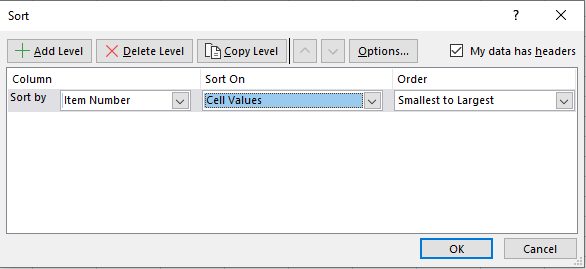
The data would be 3.7 because cell A2 would be 1, and the data in column B would correspond with sorted column A: 0, 1, 2, 3, etc.
Data can be sorted in columns or rows in:
- numerical order: smallest to largest or largest to smallest
- alphabetical order: A to Z or Z to A
- cell colours (order is limited to selecting top and bottom colours)
- font colours (order is limited to selecting top and bottom colours)
- a conditional format you have specified (beyond the scope of these notes, but useful for determining data trends (see the 44 second video at LinkedIn Learning: Excel Conditional Formatting).
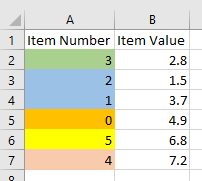
There is even hierarchical sorting, where you can sort by one parameter (e.g. cell colour) and then another (e.g. A to Z) for cells which have the same initial properties. For example, if we coloured the cells in Figure 4, and then sorted, first by colour in column A = Item Number, then by Smallest to Largest in column B = Item Value, we could get:
Filtering Data
Question
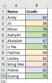
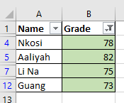
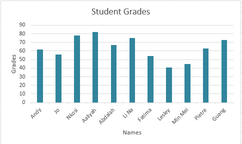
Jo. Filtering by Grade 'is less than 60' will display four results for Jo, Fatima, Ming Mei and Lesley, then sorting by Grade largest to smallest will put Jo at the top of the list, as this fictitious student achieved a better mark (56) than the other 3 students. Notice that filtering and sorting this way, automatically adjusts all the associated data, not just the column you are filtering and sorting by.
Using Tables for Filtering
Another way to apply filters is to turn our data into a table first, by selecting the data and clicking Insert: Table from the Home menu. If you check the box 'My table has headers' this will automatically add options (selectable from arrows, as before) to choose filters from each column heading or to sort data. When using tables, all the data in the table is automatically selected for filtering and sorting. Tables can be formatted in the Table Design menu - for style, size, first row and first column highlighting, etc.
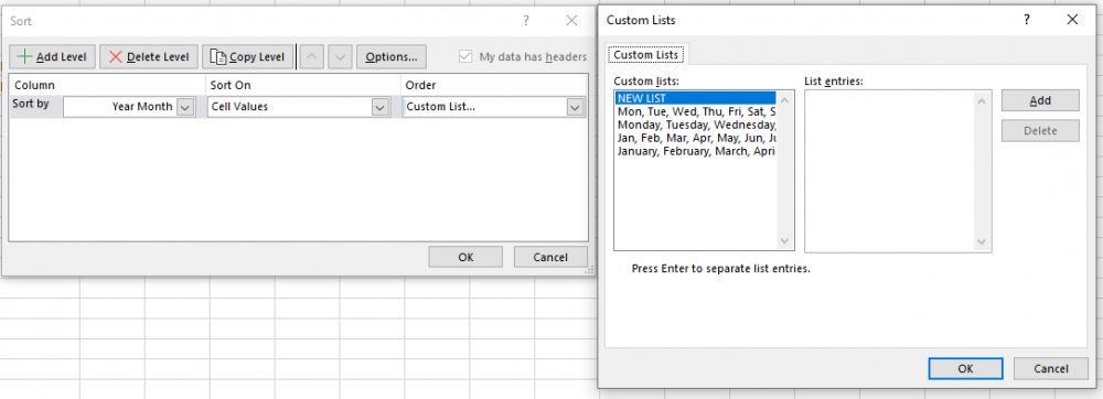
Although there are text filters which allow you to pick specific text, the text sorting features are limited to A to Z and Z to A. This can be a problem if you want to sort by, for example month, but there are some additional options if you select a cell in the column you want to sort and choose Sort & Filter: Custom Sort: Order: Custom Lists (you can create your own Custom List here as well).
Searching Data
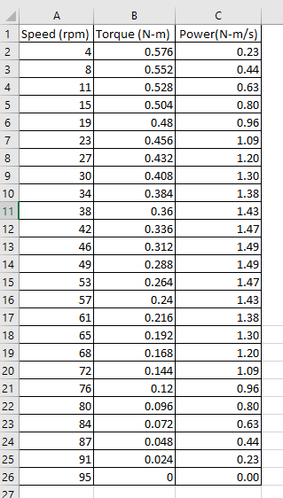
- 30 is the number we are looking up (this could, of course, be a cell reference to the number instead, e.g. if cell D1 contained the speed we wanted to look up (30), this would be =VLOOKUP(D1,$A$1:$C$26,2,FALSE)).
- $A$1:$C$26 defines the rows and columns we are looking the data up, in. We have used absolute references because this data is never going to move, but of course, these could equally have been relative references which would track the data's location if we changed it.
- 2 defines the column we want to look for the matching torque in, in this case column B which is the second column of the selected data. If we wanted to find the power which was developed when the motor was running at 30 rpm, this would be 3, representing column C, or the third column of the data.
- FALSE indicates that we are looking for an exact match, i.e. exactly 30, not 30.1 or 29.9. If you type TRUE here, Excel will look for the closest match, so for example =VLOOKUP(90,A1:C26,3,TRUE) would return 0.23, as 91 is the closest match to 90, and the power (column 3) at 91 rpm, is 0.23 N-m/s. Note that TRUE only works with numerical data in the first column, sorted from smallest to largest.
Question
What value would be returned if we typed the formula =VLOOKUP(20,A1:C26,2,TRUE)?
0.48 (Nm) as this is the Torque (tcolumn 2) which matches speed = 19 rpm, the closest match to 20. Note that if you typed FALSE instead of TRUE you would get a N/A answer because there would be no exact match to 20. This can be a bit of a nusiance if you have decimal places and you don't type in exactly the correct match.
VLOOKUP can also be used to look up words. These need to be enclosed in quotation marks, e.g. VLOOKUP("Highlands", A1:C3, 2, FALSE). The matches are not generally case sensitive (e.g. "highlands" would also work), but only exact matches (FALSE) will work properly.
If the VLOOKUP value occurs more than once in the first column, Excel will stop at the first match, and return only the value associated with this number (or text).

#N/A Errors
If VLOOKUP is giving you #N/A errors, the cause is likely to be one of these reasons:
a) The data you are trying to find is not actually in the first column. Try changing the match from FALSE to TRUE.
b) The data in the first column is not sorted in ascending order (smallest to largest). Try sorting the first column data.
c) The data in the first column is not in the same format as the search data (e.g. text instead of number). Try reformatting the first column data.
d) There are some additional characters in the first column data, e.g. spaces. If you are looking up text, you could fix this by using the Excel wildcard *, for example =VLOOKUP("Diode*",A1:D5,2,FALSE) will find all the words starting with Diode, in the first column of your data table (e.g, Diode Rectifier, Diode Signal, Diode Power could all be found). Of course, if the word occurs more than once in the column Excel will only return the answer for the first found.
Presenting and Analysing Data
This next section covers some of the most useful features of Excel for engineering:
- Conditional Formatting to highlight specific values or text to improve presentation for future analysis.
- Using Statistical Functions to analyse data.
- Using Graphs to analyse data.
It is not intended to be a detailed guide to Excel, rather just to show you some of the things it is capable of, so you can go away and explore these further for yourself.
Conditional Formatting
The first action we will look at is Conditional Formatting, accessed by selecting the data to be formatted and, from the Home menu, choosing Conditional Formatting. This allows the reader to do quick visual analysis of trends, and cells with conditional formats can also be quickly found using Find & Select: Conditional Formatting (on the Home menu): . The menu items in Conditional Formatting are:
Highlight Cells Rules
Excel can automatically highlight cells, with font and background colours of your choosing, according to rules:
- numerical cells with values greater than, less than or equal to a specified number.
- numerical cells with values between two specified limits.
- numerical cells that contain duplicate numbers.
- text cells that contain a specific text string.
- date cells that fall within a specified date range (e.g. yesterday, last week, next week, etc.
Some Tips
Conditional Formatting builds up if more than one rule is applied, so if yout don't want this you need to to do Conditional Formatting: Clear Rules, before applying new rules.
If your Conditional Formatting isn't working, it is likely that your rule doesn't evaluate to True or False. Although the options for formulae are extensive, some can be a bit tricky to get a Boolean answer from.
Top/Bottom Rules
Excel can automatically highlight numerical cells with font and background colours of your choosing, according to rules:
- the ten cells with the highest or lowest values.
- cells with numbers that rank in the top or bottom % number specified (e.g. the top 10%).
- cells that are above or below the average value of the data selected.
Custom Rules
All the highlighting rules are editable through the Manage rules menu, where you can create new rules, change the values which apply to the rules, change the cell highlighting colours or cell font, etc. Excel also has an option where you can create custom rules. An example of this is shown below, but there are also good videos at Linkedin Learning: Conditional Formatting (8 minutes) and Applying conditional formatting with a formula (3 minutes).
Formulas can be edited through the Manage Rules menu. Usually Show formatting rules for 'This Worksheet', needs to be selected.
Data Bars
Excel can highlight numerical cells, with coloured bars, in colours of your choosing, which get longer as numbers get larger, and shorter as numbers get smaller.
Colour Scales
Excel can highlight numerical cells with colours, of your choosing, which correspond with their values, e.g. red for maximum number, blue for minimum number, and sliding scales of colours, e.g. red to light red to light blue to blue for cells between the maximum and minimum values.
Icon Sets
Excel can attach icons to your data, so that different icons are assigned to different values. This is useful if you want to Sort on Conditional Formatting Icon (e.g. to put numbers in a specific range together) or Filter by Cell Icon.
Example using Custom Rules
Figure 8 shows the mean temperature per month, from 2010 to 2019, for a fictitious northern hemisphere country (the data was generated using Excel's =RANDOMBETWEEN() function).
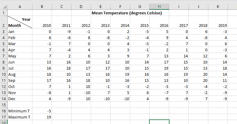
If we run a market garden, we might be interested in highlighting whenever the temperature goes above or below specific values, e.g. >19 oC or < -5 oC. There is no pre-defined rule which can do this. In Figure 8 these limits have been typed into cells B16 and B17, although they could just be entered as values in the formula, but this doesn't allow a reader to see or change them easily. Selecting cells B3 to K14, we can set up Conditional Formatting: New Rule : Use a formula to determine which cells to format. The formula will be =OR(B3< $B$16,B3>$B$17). B3 is the top left cell of our selected data (white cell) and needs to have a relative reference, $B$16 defines the cell (fixed, so absolute reference) which contains the minimum temperature and $B$17 contains the maximum temperature, both of which can be assumed to be constant, so using absolute references. We can also use the Format button (in the New Formatting Rule pop up box) to format the highlighter to make these cells fill pale orange. The result of doing this is:
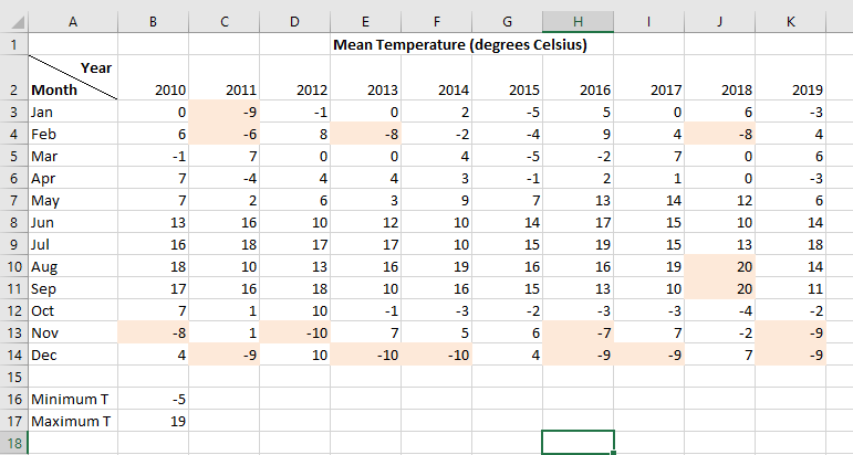
The sheet is dynamic, so if we change any values it will automatically update the highlighting. Note that you can turn off automatic updating by selecting Formulas: Calculation Options: Manual, but this is rarely done as updates then need to be initiated by Calculate Now or Calculate Sheet.
Question
If we type a new Conditional Formatting Rule =AND(ISODD(B3),B3<-5) with Formatting to make highlighted cells fill yellow, which cells in Figure 8, will be filled yellow?
Only cells containing -7 or -9 (odd numbers less than -5) will be highlighted, i.e. cells C3, H13, K13, C14, H14, I14 and K14.
Using Statistical Functions
Doing statistical calculations on Exel spreadsheets is so common that Excel have included a quick menu button on the Home menu. The choices here are:
 |
This adds all the values in the cell array (row) to the left of it, or all the values in the cells cell array (column) above it. This menu also gives access to all the Excel functions, under More Functions. |
| Average | This finds the average of all the values in the cell array (row) to the left of it, or the average of all the values in the cell array (column) above it. |
| Count Numbers | This tells you the number of cells with numerical values in the cell array (row) to the left of it, or in the cell array (column) above it. |
| Max or Min | This returns the maximum or minimum numerical value in the cell array (row) to the left of it, or in the cell array (column) above it. |
When you use these, check which cells are being used for data, as these are dynamic and can change if the function moves to a different cell. Alternatively, you can select the data first, and on clicking these, the answer will appear in the next available column (if row data) or row (if column data).
There are many more functions which can be used for statistical analysis, for example MEDIAN(), mode = MODE,MULT() or MODE.SNGL(), sum of squares = SUMSQ(), sum of products = SUMPRODUCT(), a whole range of standard deviation options =STDEV.P(), STDEV.S(), etc. Most of these can be found in Formulas: Math & Trig menu or Formulas: More Functions: Statistical. To find out more about these, consult Excel's own help or watch the videos at LinkedIn Learning: Excel Statistics Essential Training 1 (this is a 3.5 hour course but each video is only about 5 minutes long and you can fast forward through them. The most useful starting one is probably the third video: LinkedIn Learning: Excel Statistical Functions).
Array Functions
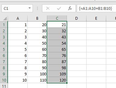
Functions can be used with entire cell arrays. This is useful if you can't easily click and drag (e.g. if the function is on a different worksheet). For example, if we had two columns of numbers and wanted to create a third column which added them:
a) Select the entire column array of answers (e.g. C1:C10).
b) Type in = and select the first column array to be added (e.g. A1:A10)
c) Type in + and select the second column array to be added (e.g. B1:B10).
d) Press CTRL, SHIFT, ENTER (or CTRL, SHIFT, RETURN on Macs). The equation will now look like {=A1:A10 + B1:B10} where the curly brackets signify an array function. Note that you can't just type in the curly brackets, because Excel will interpret this as text rather than a function.
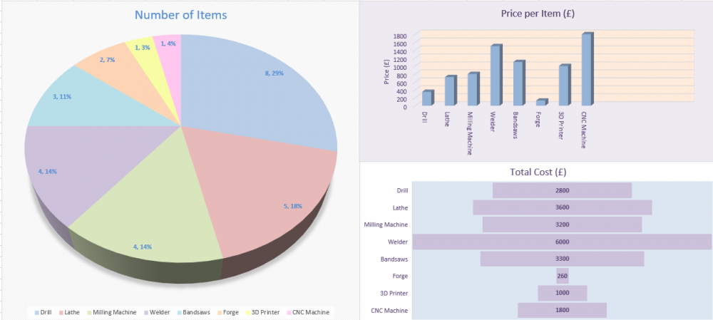
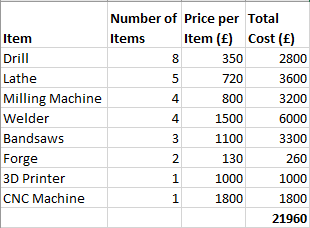
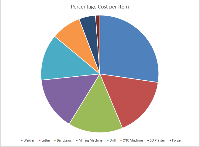
It is extremely easy to graph data using Excel, but what can be rather bewildering are the number of graph options available, from bar charts to scatter charts to pie charts, etc. We are going to concentrate on the most common ones used in engineering and explain why and how they are used to analyse data.
Scatter Chart
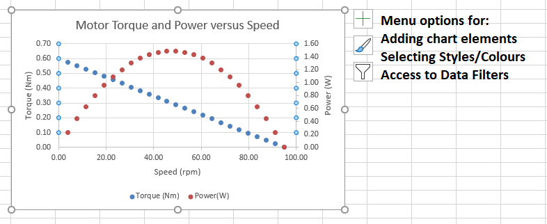
You can format most chart features by selecting which aspect you wish to change (e.g. chart area, x axis, y axis etc.), right clicking and selecting 'Format....'. Quick access formatting menus also appear on the right of the chart. The menu options are quite self-explanatory, and generally just improve appearance, not analysis, so you can try these for yourself.
| Axes | Add or edit the axes values (these should always be shown) |
| Axes Titles | Add or edit the axes titles |
| Chart Title | Add or edit the chart title |
| Data Labels | Show each data point's value on the graph |
| Gridlines | Turn on or off x and y axes gridlines |
| Legend | Add or edit the data key (legend) |
Line Chart
Column Chart

Pie Chart
Graphing Data: Common Features
Select Data Source
This pop up box can be opened by selecting the chart, right clicking and choosing Select Data.
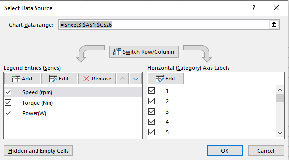
This allows you to manually edit the data series (y axis data), the x axis labels, change data legends, add and delete data series, even switch between plotting column data to plotting row data (try this - can give some interesting art effects!). Selecting the series then clicking Edit allows you to manually type in changes, and there is also right hand up arrow which will take you to worksheet from where the series came, so you can click and drag to select, instead.
Trend Lines
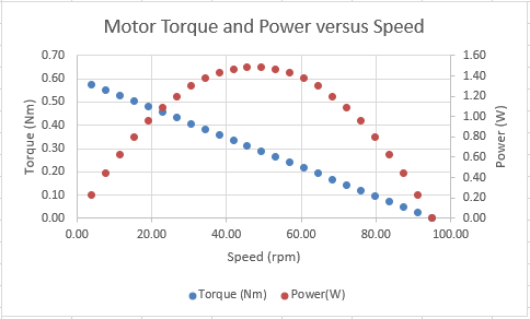
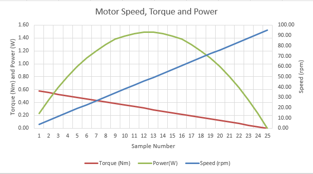
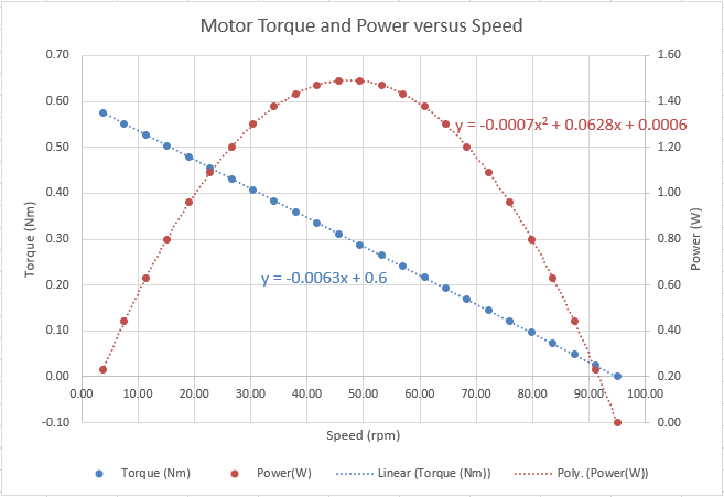
Overall trend lines can be added to your scatter and line graphs by selecting the data in the graph that you wish to analyse, right clicking and selecting Add Trendline. This can be a very useful feature for determining the equation of a polynomial plot (e.g. y = ax2+bx+c), if you select 'Display Equation on Chart'. The polynomial order should be picked, which gives the best trendline match. Of course, if you have a linear graph, you can get its equation from a trendline as well, but it is probably just as easy to determine the y axis crossing point (c) and graph slope (m) yourself, to get an equation in the form y = mx + c. There are also options for other trendlines, such as exponential and logarithmic. Figure 17 shows a linear trendline and equation for Motor Torque and a 2nd order polynomial trendline and equation for Motor Power, as plotted in Figure 9.
Question
Would you expect a motor's torque to have an inversely proportional relationship to motor speed as shown by the blue line on the graph? What about power - would you expect this to have a negative parabolic relationship as shown? Always evaluate your graphs to check they are showing what you expect, before presenting them.
Using Pivot Tables
Pivot tables are arguably the most advanced form of data analysis you can do with Excel. They are used to statistically analyse and present 'slices' of more extensive data. Although all these analyses can be done in Excel Worksheets, Pivot Tables are designed to make it easier and to give more visually pleasing reports. We are only going to give a very brief overview here but there are lots of good videos and notes on using pivot tables in Excel, for example: LinkedIn Learning: Pivot Tables in Depth.
To create a pivot table, first make your Excel data into a table (as covered in Filtering), select any cell in the table, then from Insert Menu, choose PivotTable. The data should have no empty rows or columns. Excel can also recommend Pivot Table types, based on your data, in the Recommended PivotTables menu. It is a good idea to place your pivot table on a new sheet. Then, to build the table,select or click and drag options in the right hand pane. Lets consider an example:
Figure 18 shows the weekly price of bananas from various countries, in Excel table form.

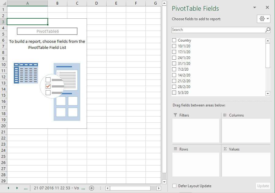
Let's suppose we want to see the average price of bananas each week. If we select a cell in the table, then choose Insert:PivotTable we get Figure 19. Then selecting Country and all the weeks we want to analyse (from 10/01/20 to 28/2/20) in Pivot Table Fields, gives us Figure 20.
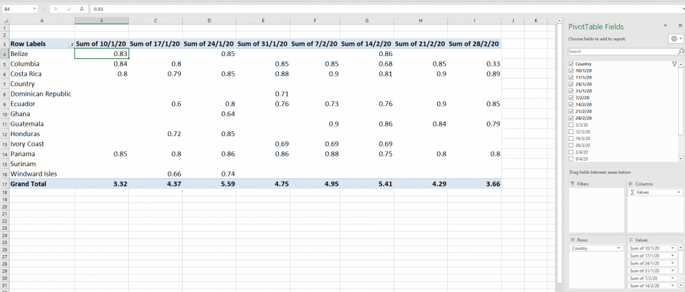
Excel has automatically moved 'Country' to the Rows pane, to give row names, and has automatically summed all the numbers in each weekly column (see them in the Sum Of box). Now getting the sum of the weekly prices is not very useful, and perhaps we would prefer to find the average weekly price. To do this we need to select each column heading in turn, right click and choose Summarize Values by: Average. You will see that the 'Sum of' header will have changed to 'Average of' and the calculation at the bottom, although still called Grand Total, is now actually the average (Figure 21). Be careful to check that the data in each column is correct and filter if necessary using the right hand arrows.
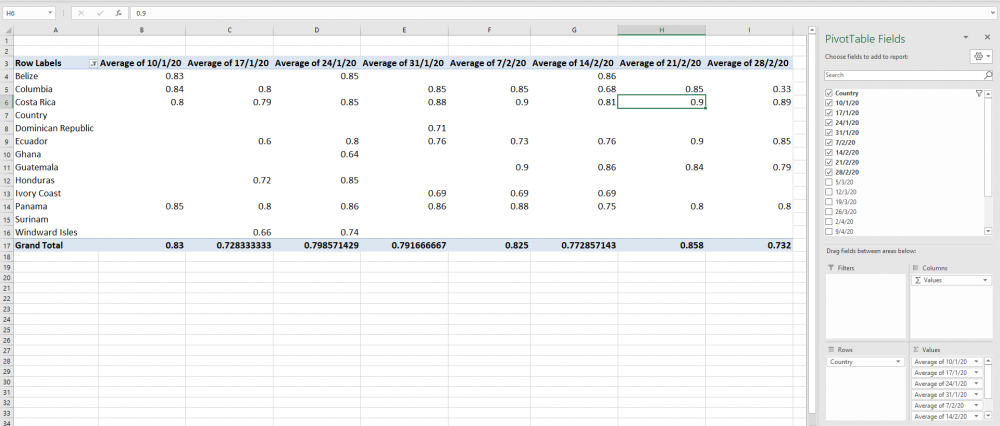
Although this might not seem very exciting, since we can easily get an average for each column in our plain worksheet, Pivot Tables only really become useful when you have a lot of data to analyse. Because they are dynamic (change with data changing), they are a very quick way to slice, filter, analyse and present information.
Summary
We hope you have found this a useful introduction to some of the more advanced features of Excel. You should now practice sorting, filtering, and searching and analysing Excel data and improving your data presentation, using the techniques you have learnt here. We have only really touched on the capabilities of this mathematical analysis and modelling tool, so if you wish to learn more, these training courses are recommended:
LinkedIn Learning Excel Online Courses
Microsoft Introduction to Data Analysis Using Excel
References
UHI (n.d.) Engineering Skills 1: Section 7 (Data Analysis Using Excel). Inverness: UHI
UK Government (2020) National Statistics: Energy Consumption in the UK. London: UK Government
--. (2020) National Statistics: Average weekly wholesale prices of bananas by country of origin [online] Available from https://www.gov.uk/government/statistical-data-sets/banana-prices [20th July 2020]


